The kitchen cabinet is a necessity in our life, and it feels like a seemingly unimportant, but it plays an irreplaceable role. Nowadays, when people decorate the kitchen, in addition to requiring the kitchen cabinets to be good-looking and easy to use, they also pay attention to the color matching of the kitchen cabinets. So, how can you decorate a kitchen that is both beautiful and functional?

Kitchen Cabinet Color Matching Tips
1. The principle of unity: the color of the kitchen cabinet should be unified with the color of the kitchen wall tiles and floor tiles. Generally speaking, the color of wall tiles to floor tiles is from light to dark, and the color of kitchen cabinets can be similar.
2. The principle of main color: the kitchen cabinet can choose the color of the kitchen tile as the main color, with white and gray, showing the level.
3. Three-color principle: The color of the kitchen is also controlled within three kinds. If the color matching is not made by a very professional designer, too many colors will cause confusion.
4. The principle of cool and warm colors: you can use cool and warm colors to match, simple, practical, novel and beautiful.
5. The main style principle: choose the color of the kitchen cabinet according to the style of the overall home decoration. For example, the warm and sweet pastoral style is not suitable for the black kitchen cabinet.

Kitchen Cabinet Color Recommendations
1. Red Passion: Passion is like fire. Although red is a more commonly used color in the kitchen, it still takes a lot of courage to paint such an eye-catching red on all the kitchen cabinets. Light up the kitchen!
2. Orange warmth: In the kitchen, in order to facilitate scrubbing, the floor is generally made of cold tiles, and other furniture is also painted with smooth and transparent paint. The good reflectivity makes the whole kitchen feel that cold. The orange kitchen cabinet is a “sharp weapon” to elevate the temperature of this cool-colored space, so that the heat and cold of the kitchen can be balanced, neither ice nor fire, just right.
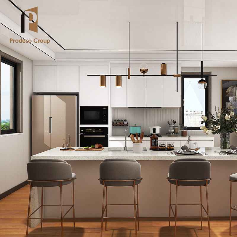
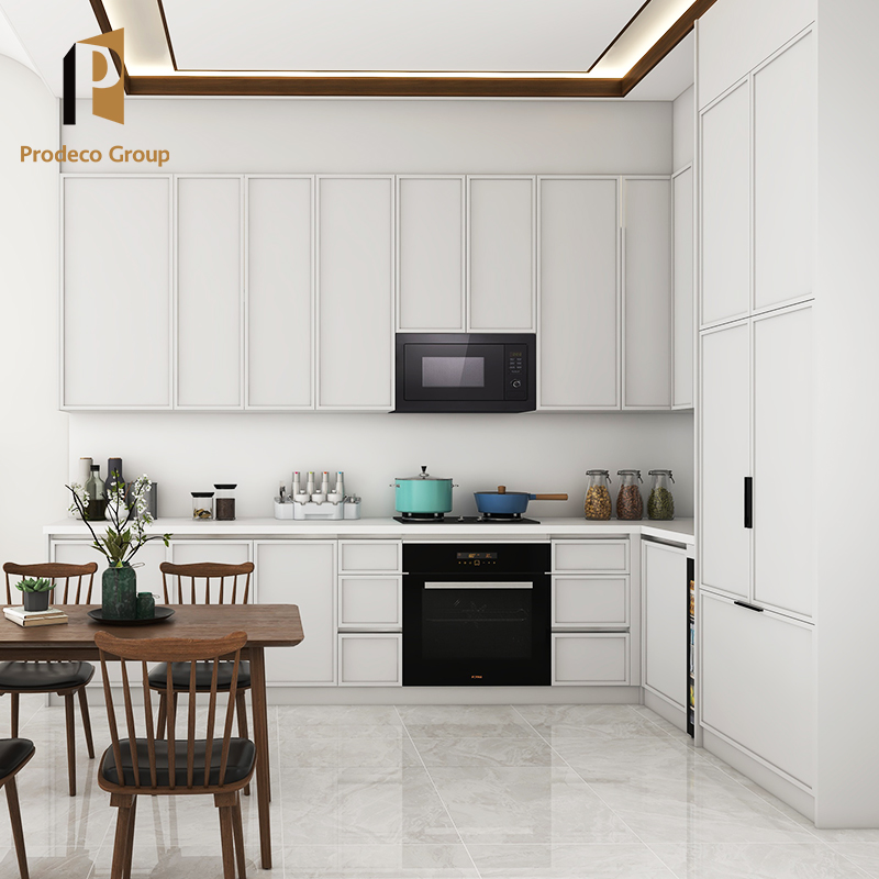
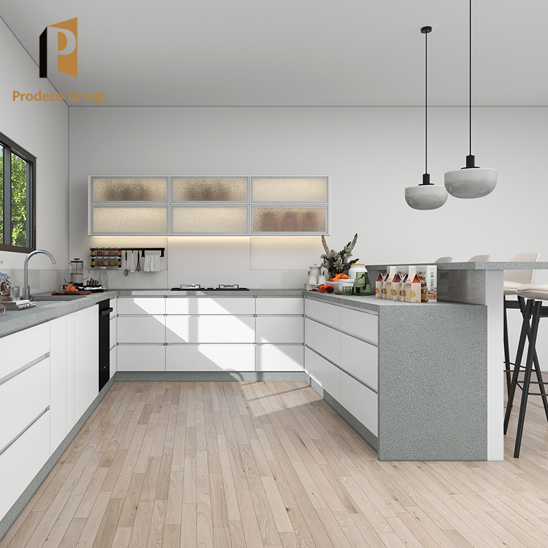
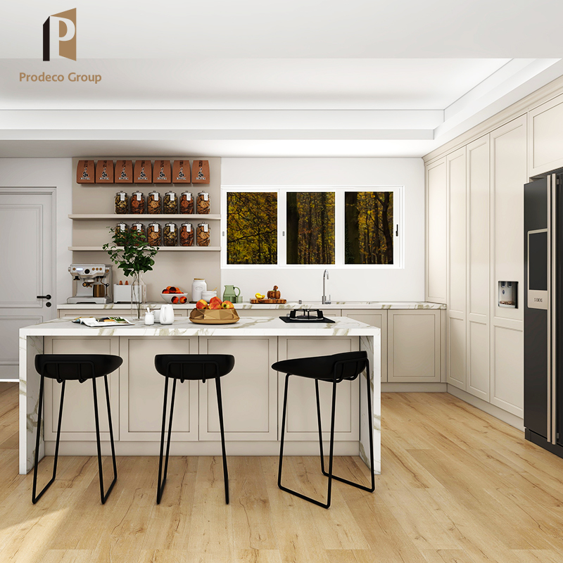
3. White and elegant: White kitchen cabinets are timeless colors, pure and clean. White kitchen cabinets are simple, elegant and hygienic, especially suitable for those who like to enjoy a quiet and clean life. White can be matched with any other tones and create a different effect. The harmonious combination with black gives people a low-key and calm feeling, quiet and soft.
4. Simple primary color: The log color kitchen cabinet has the breath of nature, and the color of the log adds a simple and elegant temperament to the kitchen, relieves people’s visual fatigue, especially suitable for the elderly, and highlights a stable personality. This color is matched with light blue and dark green, which can express a warm effect.
5. Green and fresh: The natural green is fresh and bright, reflecting the natural scenery all the time. Being in such a kitchen, people can leave all their troubles behind and dine in peace. The combination of light green and light blue makes the kitchen have a different vitality and vigor.

Precautions for color matching of kitchen cabinets
1. The above is the best color recommendation. The most important thing for the color of the kitchen is to control it within three kinds, including the color of the tiles and the floor, so the color of the kitchen cabinet should not be colorful, which will “add chaos” to the kitchen.
2. In terms of color selection, it should be adapted to the conditions of the kitchen. The kitchens of most families are not large. It is recommended to choose cool colors for the kitchen cabinet panels, which are relatively clean and do not feel depressing. Black kitchen cabinets The door panel is not suitable for the narrow space structure of the small kitchen, which brings a certain visual compression to the space, and the space will feel smaller.
3. For the selection of the color of the overall kitchen cabinet, it is best not to use neutral colors, but to choose colors with higher brightness, such as white, milky white, fruit green, blue, light yellow, etc. In addition, jumping colors such as orange-red, orange-yellow, and tan can stimulate appetite, and can be used for embellishment and eye-catching effect.
4. When collocation of cool and warm, you need to pay attention not to divide the two colors equally, but also to distinguish which is the main color and which is the embellishment.